




Refreshing the original Metagigs brand website experience

Overview
Metagigs is a game coaching marketplace designed to help studios boost player retention through customized training and progression systems.
By redesigning its official brand website, I transformed complex mechanisms into a clear and engaging narrative that highlights both the product’s value and long-term vision.
" height="1px" id="doSAS4KC2" width="1240px"/></g></svg>)
My Role
UXUI Designer
Duration
Dec. 2024, 1 month
Goal
Enhance the Metagigs brand website by improving its information architecture, visual hierarchy, and overall user experience, ensuring that the platform’s mechanisms and value are communicated more effectively to investors and potential stakeholders.
Let's see the final redesign website first
Pain Points
Why Redesign Was Needed
The previous Metagigs website was cluttered and unclear, making it hard for investors to understand the product’s value.
The following sections highlight key issues that required a redesign.

Header & Hero section
Navigation was limited and redundant, with missing key tabs and duplicate links.
The hero headline was vague and failed to communicate what Metagigs offered.
No clear value proposition left visitors uncertain about the product’s purpose.

Value Proposition Section
Focused on roles (“Coach, Guide, Advisor”) instead of clearly stating Metagigs’ unique benefits.
3D characters distracted attention from the core message.
Talked to players, but didn’t explain the value for game developers.
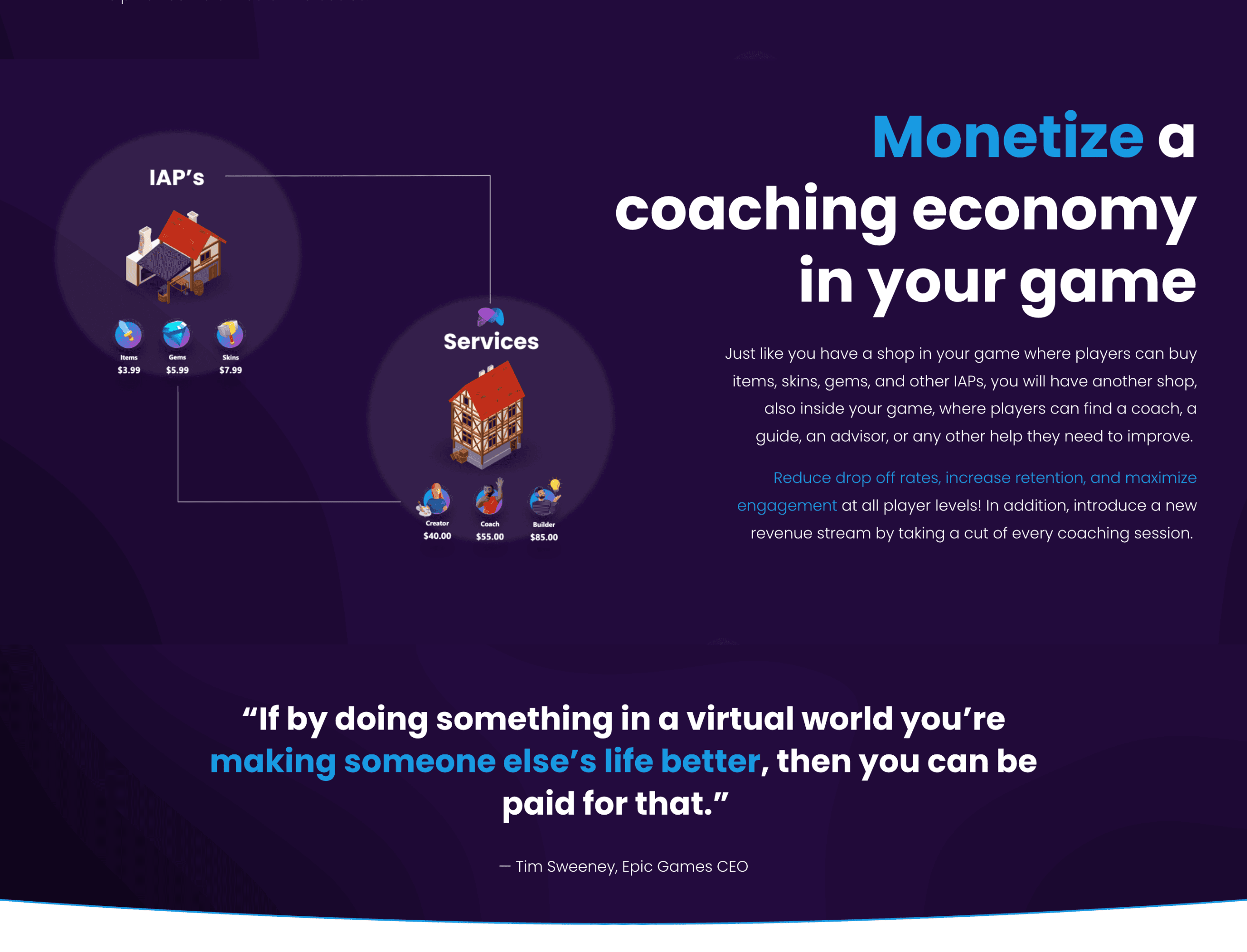
Monetization Section
Visuals are cluttered and distract from the main idea.
The revenue model is explained vaguely, without clear steps.
Claims like “increase retention” feel generic and unsupported.
Defining Priorities
From Challenges to a Clear Design Direction
In our initial workshop with the client, we aligned on two priorities for the redesign:
Clearly communicating Metagigs’ core value

Explaining how the system works in a simple and engaging way
Having uncovered the main pain points, we moved on to align with the client and structure the redesign around clarity and impact ✩
Design Solution
Shaping the New Metagigs Website
The redesigned interface prioritizes clear information hierarchy and intuitive navigation, enabling investors to quickly grasp Metagigs' value proposition and core mechanisms.
01 Redefining the First Impression
Introduced smooth animations to create a more dynamic and engaging entry
Added a clear “Explore More” CTA to guide users deeper into the site
Organized essential navigation tabs for easier access to key content
02 Highlighting Core Value Drivers

Clearly framed the platform’s unique value for retention, monetization, and community
Organized benefits into three concise pillars for faster understanding
Strengthened visuals and copy to better align with investor expectations
03 Clarifying the Journey
Simplified the flow into three clear steps
Enhanced readability with visual hierarchy
Aligned tone for a consistent brand voice
Curious about my work, or have suggestions to share?
I’d love to hear from you, let’s connect!